Making an academic poster
I’m going to a Harmful algal blooms and climate change symposium in Gothenburg in May and one of the usual prerequisites for attending such gatherings is to produce an academic poster (or, for the more experienced, to give a presentation) displaying and explaining your research.
At the moment, as a new researcher, I don’t have any results to share. Yet the symposium is highly relevant to my project and so we (that’s my three supervisors and me) felt it was important for me to go and hear all the latest developments in this field of research. But I still have to produce a poster, which will mainly act as an advert for my project, to let other researchers know what we’re planning to do and hoping to find out.
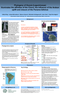
Consequently, I’ve been looking online for hints on how to make a good poster. I did make one (in PowerPoint*) in 2010 to show at the annual Young (haha!) Systematists Forum held in the Natural History Museum, London.
 Snowfall and icy wings meant that the poster and I were delayed in Edinburgh airport for several hours. Eventually we took off for Gatwick only to be diverted to Stansted, where we arrived at 0130. There were lots of passengers waiting to be allocated hotel rooms for the night by the airline, but having looked at the weather forecast and the queue for beds, the poster & I camped out on the airport floor and caught the earliest possible plane home (23 hours door to door via Stansted airport), and never made the Forum.
It wasn’t a wasted effort though. I have submitted the poster as part of a number of applications and at the time felt quite pleased with how it turned out. HOWEVER(!), looking at it now and re-reading advice and pointers, there’s quite a bit wrong with it, mainly I’d say with the layout, the colour scheme (note colour use on the phylogenetic tree….aarrrggh!), and the use of low res images.
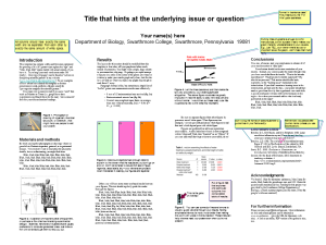
I still like this portrait, 3-horizontal-sections layout (a free template for noncommercial use, borrowed in 2010 courtesy of http://www.swarthmore.edu/NatSci/cpurrin1/posteradvice.htm) but not many people seem to use it and I’m wondering whether it’s no longer the done thing.
During my most recent trawl around the internet for poster design tips, I found a really useful and helpful adobe presentation via the University of Leicester website and here’s a summary of the points I thought were most important:
- Size: A0 or A1
- Text: Aim for 250 words (can be 300-500 max)
- Title, plus max 2 further levels of headings ie Heading, subheading in Bold.
- Break up large areas of text with subheadings.
- Text needs to be readable from 2m.
- Be consistent with font (2 fonts max).
- Be consistent with text formatting.
- Use italics, underlining & capitals sparingly.
- Group sections of text appropriately; apply the principle of proximity.
- Line spacing for headings/titles: 0.9 for bigger text.
- Line spacing for body text: 1.1
- Left justified is best.
- Layout: logical and use a grid.
- Images/graphics: high res (min 300ppi).
- Charts/Tables: keep simple, enlarge text, thicken lines; default formatting is rarely appropriate.
- Colour scheme: use 2-3 different colours plus black, which is always best for the smallest text. Use colours from your images or a colour wheel (analogous, complementary or shades).
- Check thoroughly: before sending to printers, print A4 in colour, stick on wall and check, check, check.
I’ve attached below a few other free to use templates, all giving relevant advice. (Sorry – they wouldn’t load as PowerPoints, so I’ve turned them into PNGs.) BUT, and this is a MASSIVE but, as I was uploading this post I saw that the man whose free template I used in 2010, now recommends several programmes to use and the dastardly *PowerPoint is not included. One, however, is LaTex, which is already on my to learn list, so maybe now’s the time to start.


